Back to Work

Hemingways

Redesigning the VEX Rewards Gifting Platform

As a market leader in digital gifting, Hemingways powers millions of digital gift card orders every year through its Vex Rewards platform. They engaged LION+MASON to redesign the platform, focussing on making it easier to use for new customers, encouraging more clients to self-serve, and reducing inquiries into Hemingways' in-house support team.

Client
Hemingways
Industries
Retail
Duration
3 months
Services
User Research
Competitor Analysis
UX Audit
Wireframes & Prototypes
User Testing
High Fidelity Designs
Design System
Hemingways

The Challenge

VEX Rewards sits at the heart of Hemingways’ gifting business, and whilst the platform contained strong underlying functionality, several issues were negatively impacting the user experience:

  • Outdated Design: The platform looked old-fashioned and failed to reflect the current brand.
  • Poor Product Presentation: The site does not showcase the full value or range of brand gift cards.
  • Difficult Workflows: Hard-to-use features prevent clients from managing tasks themselves, forcing Hemingways’ customer support team to step in manually.
  • Slow Setup: Signing up new clients is a long, manual process.

LION+MASON were engaged to deliver a user-centred redesign of the platform, with the aim of modernising the look and feel, boosting self-service, and elevating overall brand perception.  
Our Approach

We conducted a full user-centred design project, starting with initial discovery, moving into user research, concept creation and user testing, and finishing with high-fidelity designs and a supporting design system.

Research & Discovery

To understand what needed fixing, we began with three key discovery activities:

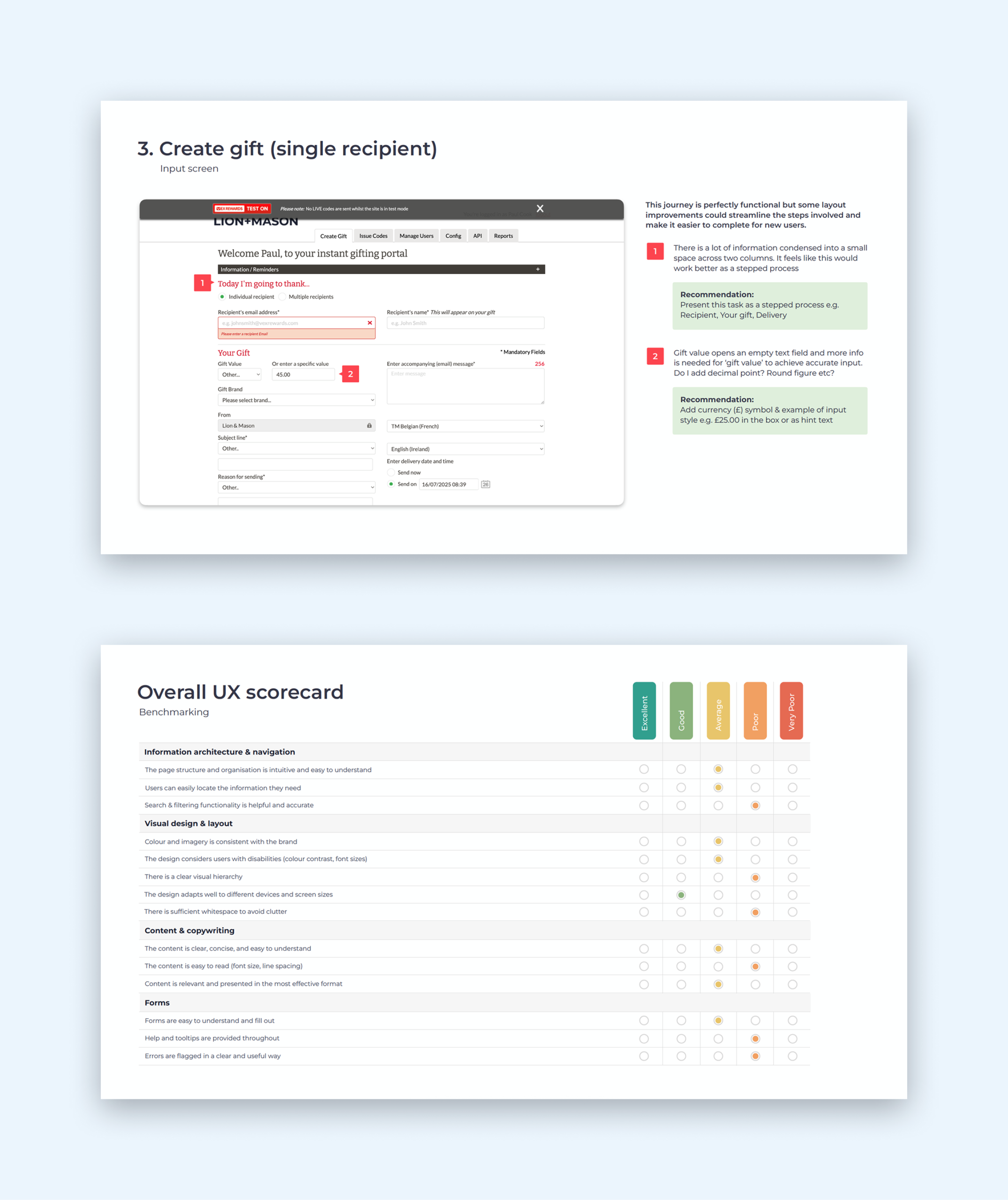
  • Platform Audit: LION+MASON consultants thoroughly tested the existing system across desktop and mobile. They identified major usability issues:
    • Cluttered Layouts: Pages packed too much information into narrow side-by-side columns with very little breathing room, making forms hard to read.
    • Frustrating Errors: Warning messages often popped up only after a user finished filling out a long form, or appeared in temporary pop-ups that disappeared before users could read them properly.
    • Outdated Look: The platform looked like an old administrative database rather than an exciting gift-giving service.
  • Customer Interviews: LION+MASON interviewed ten active business users on video calls. While customers praised how fast gifts were sent, they gave the design a low score (6 out of 10). Most users stuck strictly to two tasks—sending gifts and viewing reports—and relied on trial-and-error because the system lacked instructions.
  • Market Scan: The team studied competing corporate reward platforms to learn what modern features customers expected, such as upfront video demos, quick visual search filters, and cleaner branding.
Extract from the UX Audit

Wireframes & User Testing

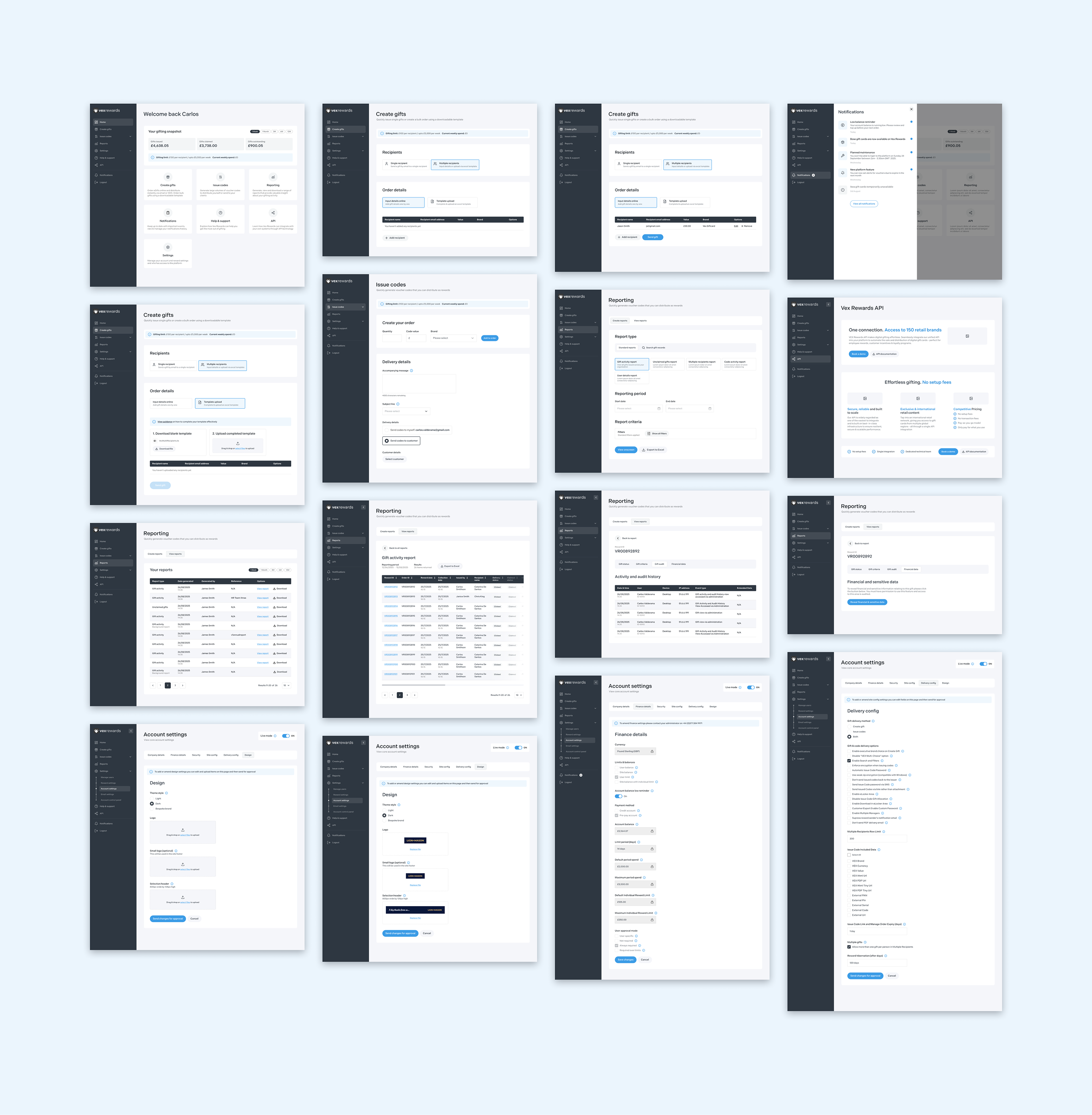
Building on the research findings, LION+MASON created a new blueprint for how the platform should look and behave.

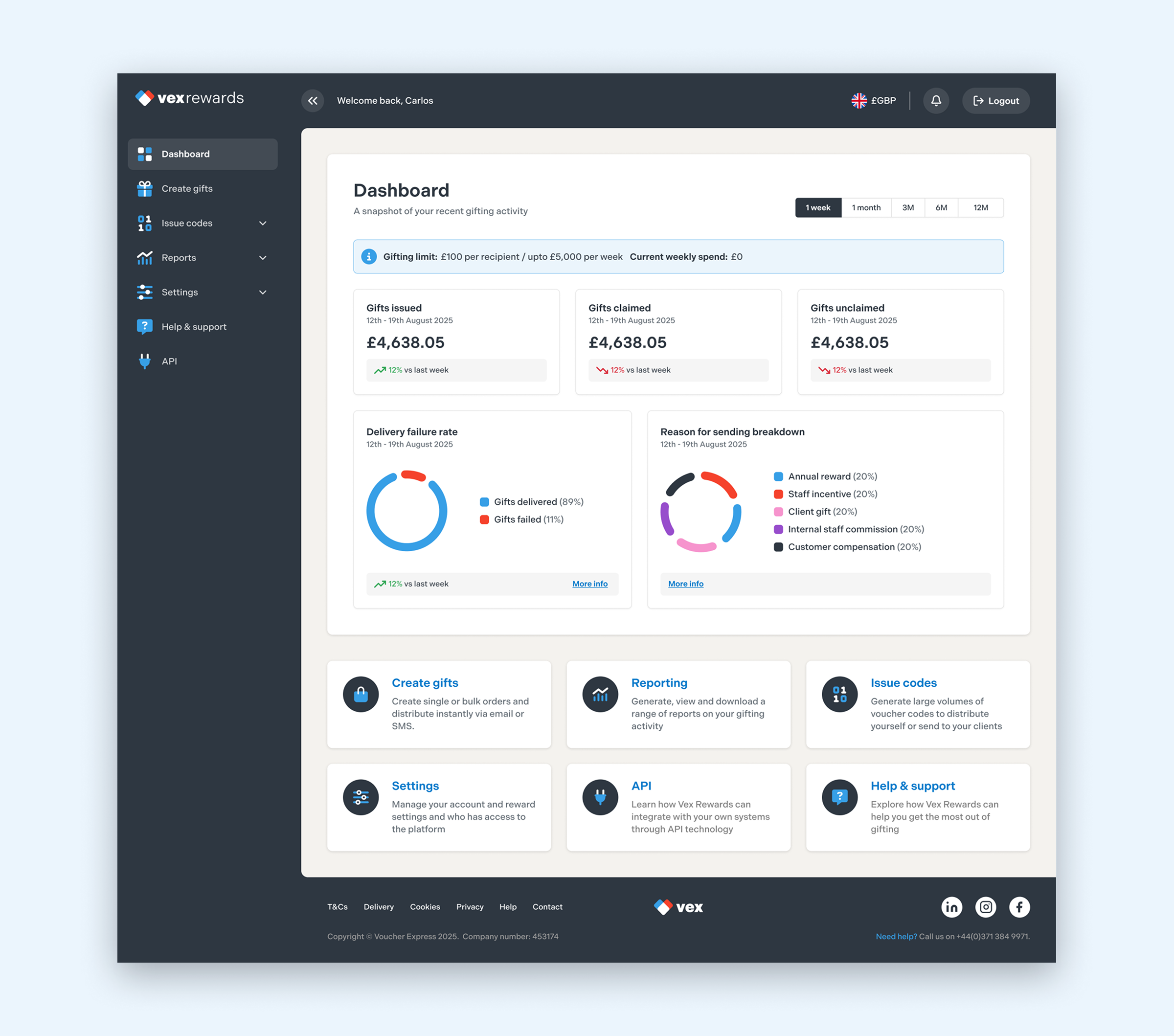
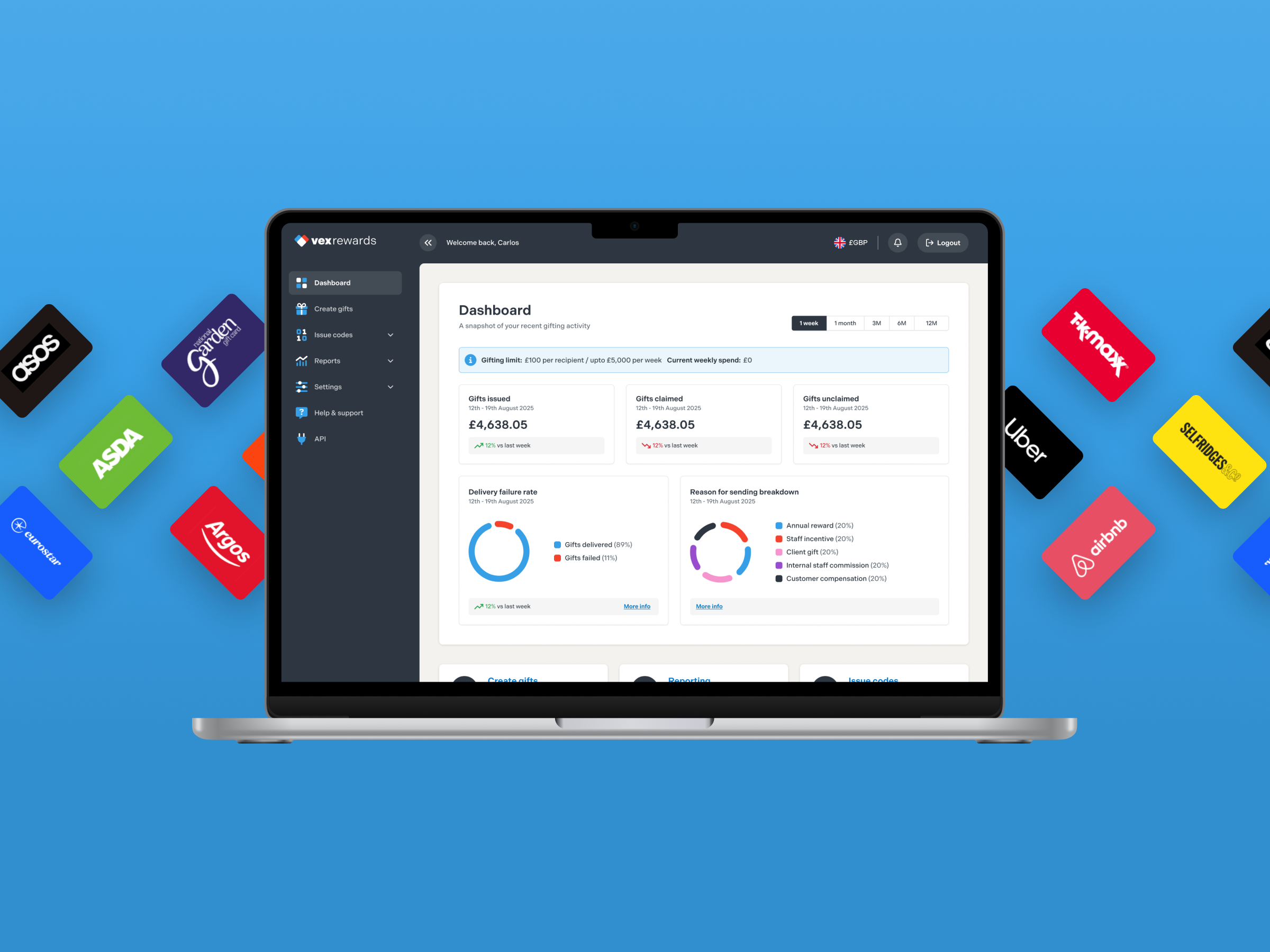
  • New Navigation & Homepage: We replaced the cramped top menu with a clean left-side navigation bar. We also built a clear homepage dashboard showing quick account stats (such as total money spent versus claimed gifts) and large shortcut buttons for popular tasks.
  • Simple Screen Layouts: The team redesigned all pages into single-column layouts with plenty of white space:
    • Step-by-Step Gift Creation: Sending single or bulk gifts was split into clear, progressive steps (1. Recipient, 2. Gift Details, 3. Delivery) featuring clickable brand logos and automatic search filters.
    • Better Bulk Uploads: The team added clearer instructions for uploading spreadsheets and enabled users to fix errors directly on screen instead of starting over.
    • Easier Reporting: Report screens were updated so users could easily filter, sort, and search their data directly on the screen.
  • Customer Testing: The team built interactive prototypes and tested them with real users. The tests confirmed that step-by-step forms and visual brand filters cut down user mistakes and made sending gifts much faster.
Selected wireframes
Selected wireframes

UI Design & Design System

In the final phase, LION+MASON translated the validated wireframes into high-fidelity designs using Figma.

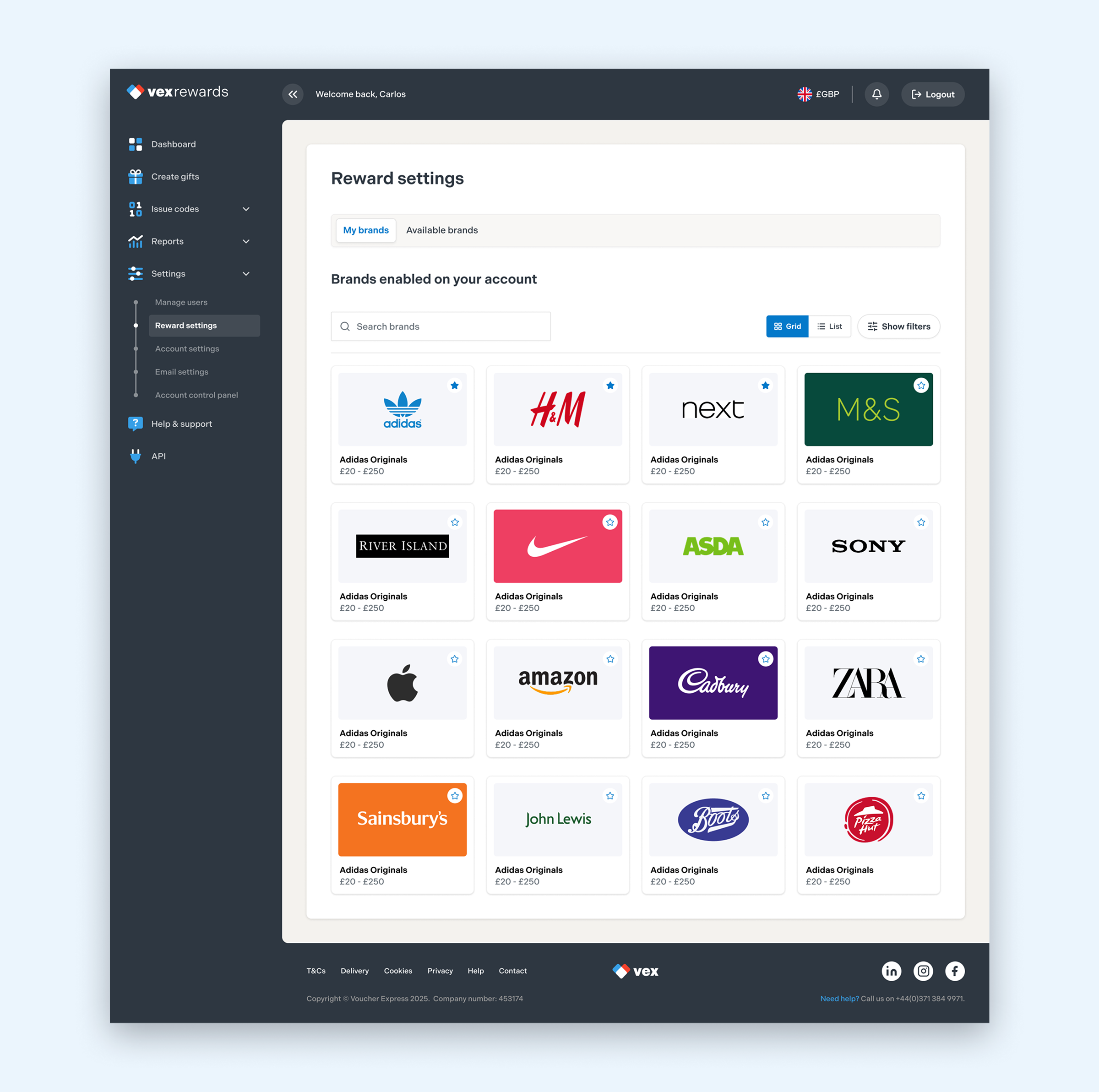
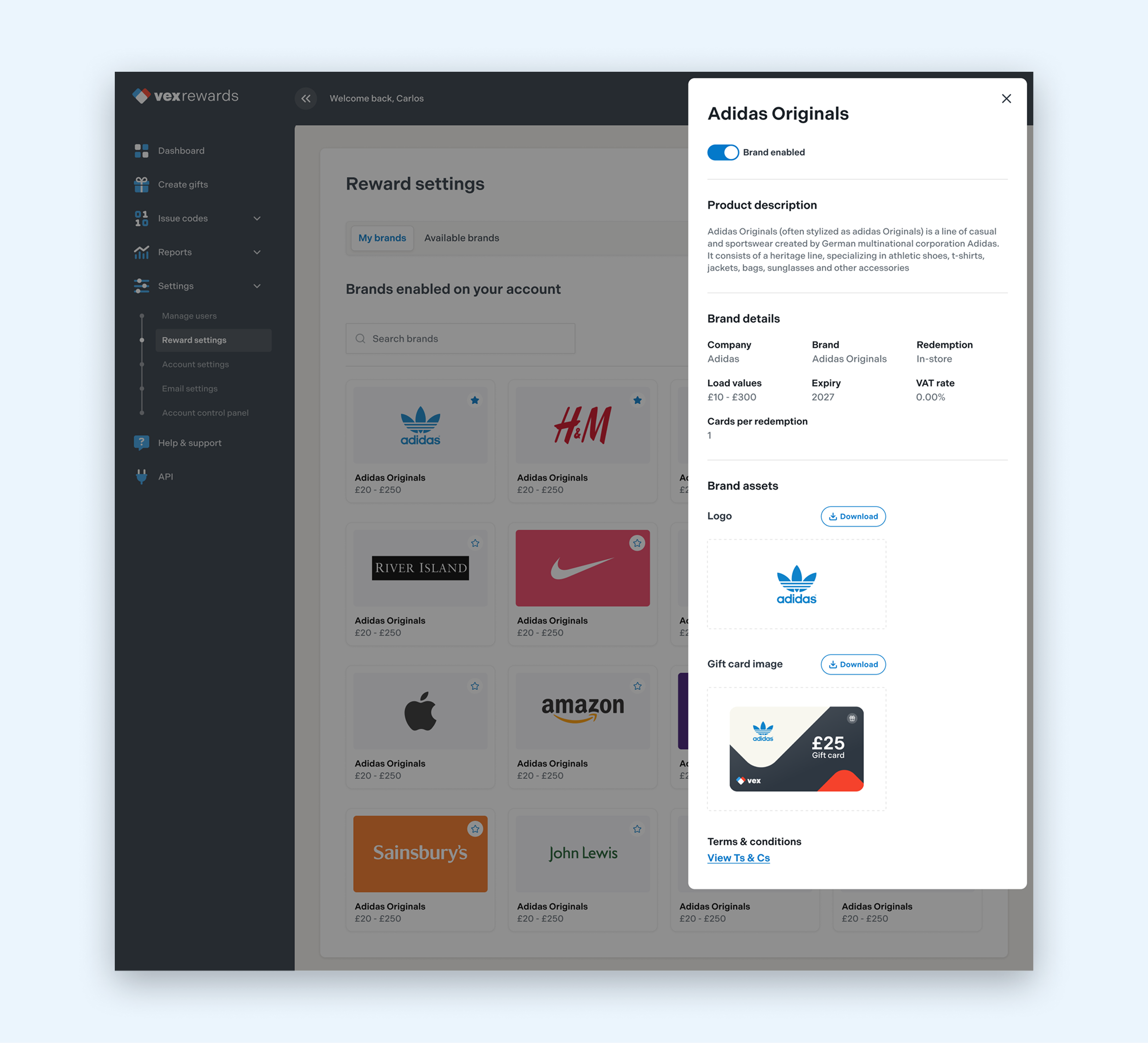
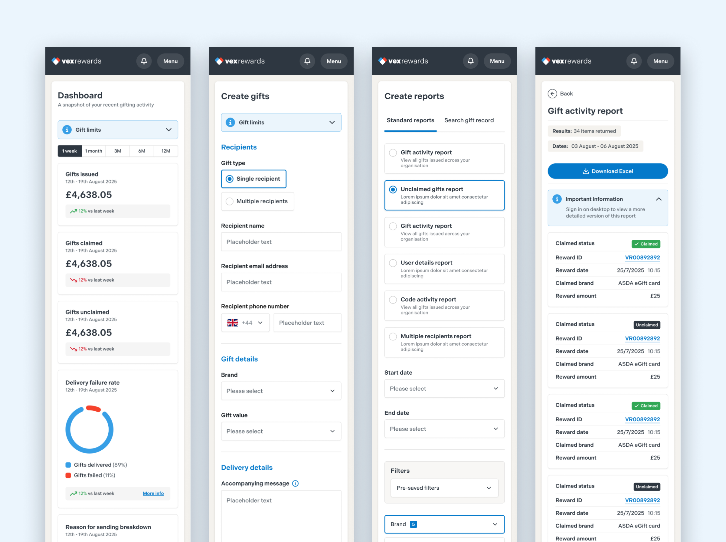
  • Modern Platform Redesign (Desktop & Mobile): The team replaced the old, plain design with a fresh, modern look aligned with the Voucher Express brand. They added readable text, clean color-coded status tags, and high-contrast buttons. They also made sure complex data tables stacked neatly when viewed on smaller mobile screens.
  • Design System & Component Library: LION+MASON created a master library of design components in Figma, giving the Hemingways development team the flexibility to easily build new screens in the future while keeping the platform looking consistent and modern.
Selected UI Designs
Selected UI Designs
Selected UI Designs
Selected UI Designs
Selected UI Designs

Conclusion

The redesigned platform tested very well with internal stakeholders and a select group of long-term customers and is now undergoing phased development and rollout.