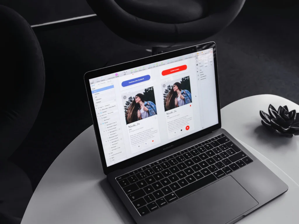
Let’s talk cards! No, not Christmas cards just yet, we’re afraid. We’re talking about another type of card, although it will still make you smile when used correctly, just like a Christmas card. Cards are one of the most popular UI design patterns. For example, Netflix, Facebook and other large brands all use card layouts, albeit distinctly different card layouts from one another. When you start to look in detail at the UI’s you use daily you will notice these cards more and more frequently. However, the beauty in cards is that you don’t specifically see them as ‘cards’; they blend seamlessly into the user interface, enhancing that overall experience.
What is a card?
There are a few different definitions of what a card is; Nielsen Norman Group defines a ‘card’ as a UI design pattern that groups related information in a flexible-size container visually resembling a playing card. Google’s Material Design 3 states that:
- A card is identifiable as a single, contained unit.
- A card can hold anything from images to headlines, supporting text, buttons, lists, and other components.
- A card’s layout and dimensions depend on its contents. There is no one right way to make a card.
Audi’s design system states: Cards contain elements and functions on a single topic and can be used as teasers for additional content. They optionally show text, icons, an image or a video, links and triggers – alone or in combination. The format, size and layout of a card are flexible within the layout structure. Pretty self-explanatory, right? We define a card as a flexible UI component containing related information. Just like a physical business card, a visual grabs the attention and the card has all the necessary information grouped together in a small, digestible format.
Why are cards so popular?
Cards are popular for a good reason.
- They are intuitive; due to their commonality, users are familiar with them and know how to interact with them accordingly.
- Their clickable nature is helped by subtle shadows, attention-grabbing imagery and soft edges perhaps inspired by their tangible counterparts.
- They are flexible regarding their adaptiveness to different screen sizes and ability to display information in various formats, sizes and shapes.
- They provide structure and help organise information into meaningful sections, making content more scannable that’s easy to digest.
- They adhere to laws and gestalt principles such as Fitt’s law, which make them user-friendly and popular with users and UI designers.
If cards are popular, does that mean we should always use cards?
No, whilst there are many benefits of using cards, they are not the solution to every problem. Of course, it depends on the information you are trying to convey and the user’s needs at that point in their journey. Let’s imagine your user wanted to browse a dashboard regarding their energy usage over the last seven days. We can use a card that displays the total energy used over the seven days. This might have a title, a total and a CTA. Then for further context, we might have a card that shows two bar charts, one for gas usage and another for electricity, again with legends, totals and CTAs. Then another card shows how much energy has been used each day of the week and so on. These cards contain high-level related information grouped into smaller manageable chunks. Clever use of space, size, and position helps the user focus on each specific card without overwhelming them with all the information in one go. However, suppose your user wanted to see which devices used the most energy over a set period. In that case, this requires more intent than a casual browse, so a more hierarchical list showing the consumption from high to low would be a more appropriate pattern. In short, don’t just jump to cards as the solution without thinking of the user’s needs, cards may work for most things, but it doesn’t mean it’s necessarily the right choice regardless of their popularity.
Conclusion
UX Designers love cards, and so do users, but we should only use them where appropriate. We should tailor our cards to meet the user’s specific needs by experimenting with size, proximity and colour to create more logical groupings and hierarchies that grab attention and draw the user to navigate deeper. Undoubtedly, their popularity will continue to increase due to their flexibility in creating beautiful, consistent experiences. If you need help realising your solution with our expert user research techniques and considered design approach, please contact us.