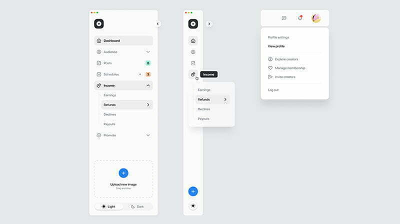
Is top navigation or side navigation better for your product?
Image Created by Tran Mau Tri Tam for UI8
Top navigation or side navigation: which navigation menu style is best for your product?
Navigation menus are vital to user experience and interface design. So if you’re working on a new website or app, choosing a navigation layout is a major consideration.
But is top navigation better than side navigation? Chances are, it all depends on your product.
Your primary, secondary and tertiary navigation controls are one of the most clicked-on parts of a web interface. Whatever option you choose, your navigation menu provides important information to your users, so it needs to be visible and user-friendly.
Comparing the different structures
Research by Jennifer Rose Kingsburg identified major benefits for choosing a left-hand navigation panel. The study found left-hand navigation faster to navigate and helpful for minimising user navigation. It also leads to fewer cursor movements and reduces selection errors. What’s more, most users in the study expressed a strong preference for a left hand side primary navigation over a top one.
Overall, the study revealed the preferred navigation layout as left/top/top, followed by left/left/left. The least popular option was top/top/left, followed by top/left/top. Details of the research findings are available here, but here’s a summary:
- Best for fast navigation – left/top/top or top/left/left
- Best overall UX – left/top/top or left/left/left
- Preferred user option – left/left/left or left/top/top
- Best to avoid – top/top/left and top/left/top
Although the outcomes of this study are useful, bear in mind that it was carried out in 2004, so things have evolved since.
Advantages of using left side navigation
- It’s easier to scan. Users are prone to scanning web pages in an F shape pattern, meaning top and left navigation are both good options. Using left navigation allows the user to scan vertically, improving speed and reducing visual fixations.
- It’s easier to scale. If your information architecture is formed of many top-level items that can’t be categorised into a few buckets, left side navigation is your friend. You’ll also be able to easily add more items if your product or service options grow.
- It supports variable menu structures. A left side navigation pane is easy to scale, so if variable menus are important to your users, this is the option to go for.
- It’s consistent with most desktops. The side navigation pane is familiar to users of macOS and Windows products, since the top part of the screen is used for the menu bar.
Advantages of using top navigation
- It’s more compatible with hover activated submenus. If you choose a left side navigation with drawer-style submenu, your users will likely experience problems when it comes to diagonal cursor movements. And no matter how many items are in the submenu, using side navigation means users will probably end up blocking out another vertical panel on their screen.
- It takes up less space. In its expanded form, left side navigation can take up more than 20% of the overall screen. You could opt for icons instead of text descriptions, but this will likely have a negative impact on user experience if they find it difficult to remember what each icon represents. A top navigation will probably only need to take up around 6% of the overall screen, allowing for a cleaner UX.
- It supports the use of ‘Mega Menus’. This type of hover-activated menu is increasingly popular when it comes to e-commerce websites like eBay. If you need to accommodate several different options or show lower-level website pages, a top navigation menu is a good choice. You will also have much more space to show off your product and display adverts.
What about responsive design?
When it comes to responsive design, both top and left side navigation pose their own challenges. If you don’t have too many different navigational links, using top navigation means users will be able to see all of those options using a tablet in portrait view. If you use a left side navigation, users on a tablet in portrait view will probably find that the navigational links are hidden within a hamburger menu. This isn’t necessarily a bad thing, as it means the navigation style will remain consistent across devices.
The bottom line
When choosing a navigation style, it’s important to choose the one that’s best suited to the context of your product. To summarise:
Top navigation
- Takes up less space
- Prominent on the page
- Appropriate for products without too many navigation options
- Good for general websites, e-commerce sites and web apps without a hierarchical structure
Left side navigation
- Good if your product has lots of navigation options
- Easy to scale and configure to user preferences
- Best for complex apps and websites, admin/desktop apps
- Well suited to products where user customization is important
- Supports a folder/tree structure
