Achieving the Perfect Layout for Optimal UX
Designing the ‘perfect’ UX layout for your new product or service can be daunting.
Achieving flawless UX depends on many factors including the goals of your website or application, the target audience and the type of content. The subjective nature of any type of design work can make hitting the mark feel challenging. Fortunately, with the right approach, you can create a user-friendly UX design that meets your users’ needs while providing them with a pleasant experience.
But, before we delve into our tips for achieving the right layout for your UX, let’s consider what ‘perfect’ actually looks like.
What is a perfect UX layout?
When we talk about a ‘perfect’ UX layout, we mean a layout that caters to user needs, provides intuitive navigation and communicates the site or app’s purpose. A successful UX layout should be visually appealing, easy to interact with, and free from clutter and confusion.
These crucial elements help to deliver a seamless user experience that keeps people coming back repeatedly. To create the ideal user experience, you should aim for an attractive but simple design that doesn’t overwhelm users with too much information yet still provides the necessary elements to accomplish their goals.
You should consider what content and features will be needed for users to complete the tasks they want to do. For example, if you are creating an online store, customers will need easy access to product descriptions and pricing, contact information for customer service inquiries, and a simple checkout process. Once you have identified the necessary elements of your layout, you can begin to consider how best to arrange these items on your page.
Most importantly, detailed customer research should inform any UX design before beginning work. Understanding who you’re designing products for before making any design choices is a great way to set yourself up. It helps ensure you make decisions that are based on user needs rather than personal preference.
Creating an Engaging UX Layout:
1. Keep it simple
A clean and simple layout is a great place to start when designing a new product or service. Avoid clutter and limit the number of elements on a page. This way, you can avoid overwhelming your users with too much information and focus on making the elements you choose to showcase as stunning as possible.


2. Use visual hierarchy
Using a visual hierarchy when designing a UX layout effectively directs users’ attention and guides them through the journey. Utilising features such as size, colour, texture, placement and white space can help you communicate the importance of certain elements on your page. This will help you create an intuitive user flow that is easy to navigate without being overwhelming, as users can find what they want easily, especially if your content hierarchy is executed well.


3. Follow a grid system
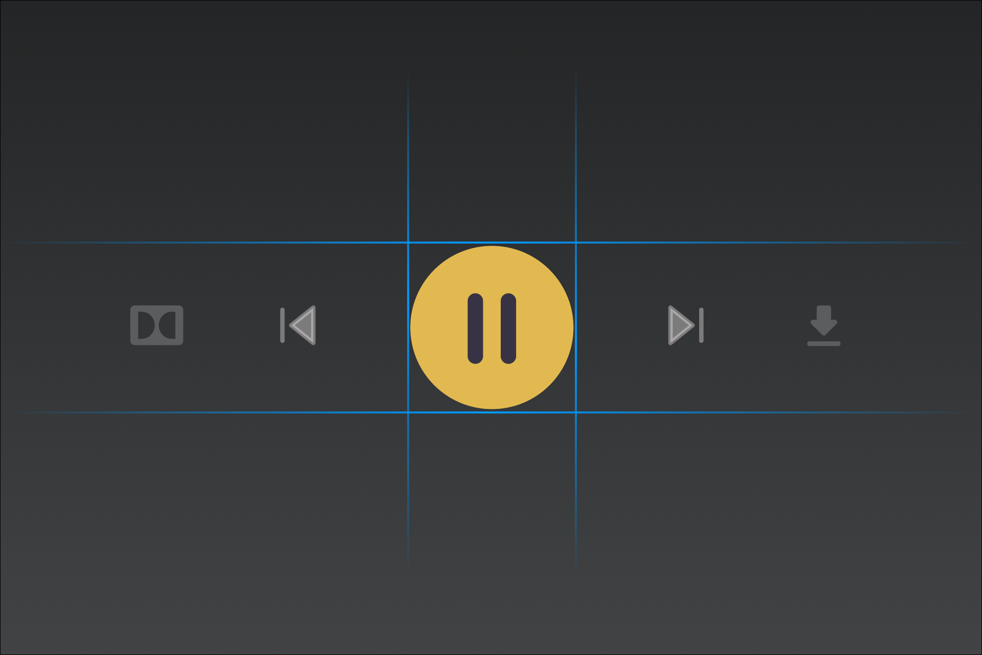
Using a grid system when designing your UX layout can help create visual consistency and structure. Not only will this make the design process easier, but it will also ensure that your site or app looks balanced and well thought-out. This can be especially helpful if you have complex content to work with, as it will simplify organising your elements. Grid systems can allow you to create a hierarchy and add visual harmony to your designs.


4. Consider mobile devices
With more and more users accessing digital services on mobile rather than desktop, ensuring that any UX layout you design is mobile-friendly is important. This means keeping mobile users in mind when creating your design and adapting your elements accordingly. Make sure you test your designs on different screen sizes, so you can be sure that all users will get the same streamlined experience no matter what device they are using. According to the UserGuiding blog, 85% of people think a business’s mobile website should be as good as, or better than the desktop equivalent. So, when it comes to hitting the mark when it comes to perfect UX layout, making your designs mobile-friendly should be a top priority.
5. Use whitespace
White space means the empty space around design elements, and no – it doesn’t need to be white! Using whitespace effectively can help create a design that is pleasing to the eye and easy to navigate, as it helps separate elements from one another to create clarity. It also allows users to focus on particular elements or features easier, improving their overall experience.


6. Test, test, test
Testing your layout with real users will help you fine-tune the details of your layout and set you up for creating the right layout. Gathering user feedback and insights will always reveal areas to improve and help you decide how best to refine your UX design. A/B testing can also be used to compare different layouts to help you determine the one that provides the best user experience.
Conclusion
Creating a smart UX layout takes careful consideration, planning and research. Keeping these tips in mind when designing your next layout will put you in a great position to exceed user expectations. With enough practice and experimentation, soon you’ll be creating engaging, user-friendly layouts that drive user engagement.
Credit Aleksandr Volodkovich on the original UI concept
