The ultimate guide to creating a great button
There’s no such thing as a user interface with no buttons.
Buttons perform a critical function in any user interface. Sometimes they trigger the main action within an app, and sometimes they provide a destination for users to click on to navigate content within an app.
But above all else, buttons are one of the most easily recognisable interface elements in any application. When you create visually compelling buttons that function consistently, you are well on your way to creating a great user experience.
In this guide, we will take a look at the essential elements of creating successful buttons for your apps. We will look at how you can use colour, shape and size to create visually appealing buttons that enhance the overall user experience. We will also explore some best practices that you can use to create buttons that work across all platforms and devices.
But first, let’s look at the key components of a button:
1. Colour and contrast: A successful button effectively uses colour. It should contrast with the background on which it resides so that it is easily identifiable by users. A button should always use a different colour or shade than its background; for example, using a dark-coloured button on a light background will help your button stand out and be seen easily by users.

Colour can also be used to differentiate buttons that have different purposes. Such as using colours like green and blue for positive actions or using colours like red for negative actions.
2. Anatomy: There are a few features within a button that a UX designer can tailor to their specific needs. These include:
Border
Icon
Padding
Background
Border-radius
Drop shadow

These elements can be tailored to increase usability. For example, icons should be placed to the left of text; this is beneficial from a user experience perspective because English is written left to right.
![]()
3. Feedback and States: Buttons can have different states that reflect their current status and functionality. For example, a button might be disabled when the user hasn’t yet performed an action to enable it, or its background colour may change from orange to blue when clicked.

It’s important to include these different states in your design so that users know when a button can be used and what action it will trigger. Visual feedback should also be given when a user clicks on a button, so they know that their interaction has been received. This could be as simple as having the button ‘dip’ when pressed by increasing the density-independent pixels.
4. Label: Buttons need labels to identify their functionality so that users know how to use them in your app. You can choose from standard textual options such as “Search” or “Login”.

It’s important to choose labels that are familiar to users and offer a clear explanation of what users can expect should they click a button.
Now that we have reviewed the essential components of successful buttons, let’s take a look at some best practices for creating them:
1. Keep it simple: One major mistake many designers make when designing buttons is making them too complicated. This can lead to confusion for users and a design that just doesn’t look good.

It’s important to keep your button designs simple by using standard shapes, standard text labels, and intuitive functionality so that users can quickly identify them and use them on all platforms.
2. Avoid clashing colours: Just as with other interface elements, such as menu bars, it’s important to keep colour palettes consistent so that users feel understood when they interact with your app.

If you use bright colours on a light background, choose a darker shade for the button highlight colour to make it stand out. Similarly, always test the contrast between buttons and their backgrounds.
3. Use standard sizes: When designing buttons for mobile apps, keep in mind that users will have to tap on them with their fingers. This means that you must ensure that your button sizes are appropriate for this type of interaction.

Generally, it’s a good idea to use buttons that are 44px by 44px so that they work well on all platforms, although you can adjust these sizes to suit your designs and the functionality of your app.
4. Tailor your button spacing, so it meets user needs. Button spacing is essential when it comes to usability. For example, mobile users will have different needs when it comes to spacing than desktop users.

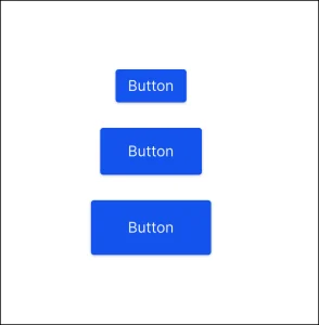
Research shows that the optimal range for button spacing is 12-48 pixels. This range changes depending on button size:
12-24 pixels – large button
24-36 pixels – medium button
36-48 pixels – small button
5. Make it clear: Buttons should also be designed with usability in mind so that users know exactly when they’re allowed to use them, what action will trigger when pressed, and how the overall design looks.
You can use different coloured backgrounds and highlights to make buttons stand out and to make it clear that they’re not just more content on the page.
6. Use the placement and order your buttons in a way that makes sense to users rather than choosing what looks best visually. Buttons should be placed in order of importance. Size and colour can be used to indicate the level of importance to users.

7. Remember, not to use too many buttons. When it comes to buttons, less is often more! Take care not to use too many buttons, as doing so could overwhelm your user and lead to a bad user experience.
8. Test on all platforms: It’s essential to test your button designs across as many platforms as possible before releasing them, especially if they need to look good in multiple sizes. Always perform visual tests on each device you’re targeting, and ensure they work well with different types of content, such as images.
Conclusion
Designing an app is one thing, but making it look great and delivering a good user experience is another challenge altogether. Button designs are fundamental in mobile apps because they represent the action interface for users. By keeping these simple tips in mind, you’ll be able to create buttons that users can identify and interact with safely and intuitively.
